上一次修改博客主题还是在上一次,这次也是2022开年这么久以来第一篇BLOG,再次写下最近最博客主题的改进. 加上上一篇优化文章内容已经足够长了,特再启一篇。
1. 代码块(行内及段)
颜色样式,滚动条
之前的样式,看着多少有点”丑”。突然又看到了原主题LeaveIt的代码样式(原作者的博客已经无法访问,但GitHub可),想着更改应用下。仿照Wyane的思路,找到文件所在位置更改但是不生效。
想到自己用的主题是LeaveIt的修改版Mogeko,随后找到了文件所在位置,大概是因为这里的代码会覆盖Wyane中所提到的方法。
因此,针对Mogeko主题,找到\resources\_gen\assets\scss\css路径下的scss文件L511左右位置,替换成以下内容。
.post-warp .post-content code,
.post-warp .post-content pre {
           	padding: 1px;
    		font-size: 16px;
            font-weight: 550;
    		font-family: Consolas, Monaco, Menlo, Consolas, monospace;
    		word-break: break-all;
    		word-wrap: break-word;
    		overflow-y: auto;
    		max-height: 300px;
        }
code:not([class]) {

            padding: 5px 5px;
            background: #fff;
    		border: 1px solid #ddd;
    		box-shadow: 2px 2px 0 #fff, 4px 4px 0 #ddd;
    		margin-left: 6px;
    		margin-right: 6px;

.dark-theme &:not([class]) {
            background: transparent;
            box-shadow: 1px 1px 0 $dark-font-secondary-color, 2px 2px 0 $dark-font-secondary-color;
            }
}这其中还包括另一个功能实现,就是给长代码添加垂直、水平滑动条。按照该网址方法添加代码,即overflow-y: auto;已经包含在上述代码中。
但是更改之后原本右下角的copy按钮在有滚动条的情况下就会很乱,因此在浏览器中改成右上角,然后调整好位置后同样应用于上述文件中。
.post-warp .post-content .highlight .copy-code-button {
    position: absolute;
    top: 4px;
    /* bottom: 10px; */
    right: 25px;
    border: 0;
    border-radius: 4px;
    padding: 1px;
    font-size: 0.7em;
    line-height: 1.8;
    color: #fff;
    background-color: #777;
    min-width: 55px;
    text-align: center;
}
这次改动学精明了点,之前调试主题效果都是本地改动,渲染效果,今天突然间意识到浏览器就可以了。
原本想更改下选中文本颜色的,但感觉蓝色也不错的。
使用carbon网站样式
偶然间在自己的书签中发现了宝藏,就是【carbon】,它可以将代码导出成图片样式,也可以生成html代码应用到网页中,而且效果也十分好看。它可以让你自定义主题、字体(类型、weight等)、整体宽度(从而适应你的网页)、行号等,自带复制按钮,功能十分强大。因此如果想更改自己的代码样式,又不想太麻烦的话,这是个很好的选择。
注意设置
style从而适用于各种设备
👍除了导出为网页代码,还可以导出为图片分享,简直不要太完美。
2. 图片caption样式
在文件\resources\_gen\assets\scss\css\main.scss_b95b077eb505d5c0aff8055eaced30ad.content的L576左右,更改.post-warp .post-content .image-caption:not(:empty)
元素的值为以下内容。这里还可以修改caption及其下划线颜色等。
.post-warp .post-content .image-caption:not(:empty) {
    min-width: 20%;
    max-width: max-content;
    /* display: inline-block; */
    padding: 3px;
    margin: 8px auto;
    border-bottom: 1px solid #d9d9d9;
    font-size: 14px;
    color: #969696;
    line-height: 1.7;
}
3. 页面布局
分类页面
这个方面主要是改变分类页面的分布,之前是两列,显得太长,改成3列。增加.post-warp最大宽度,减小单个.categories-card的padding以及.card-item的width,具体更改如下,文件位置:\resources\_gen\assets\scss\css\main.scss_b95b077eb505d5c0aff8055eaced30ad.content
.post-warp {
    position: relative;
    width: 100%;
    max-width: 863px;
    margin: 0 auto;
    padding-top: 2rem;
}
.post-warp .categories-card .card-item {
    font-size: 14px;
    text-align: left;
    width: 26%;
    display: flex;
    align-items: flex-start;
    margin-top: 2em;
    min-height: 16em;
    padding: 0 2%;
    position: relative;
}
.post-warp .categories-card {
    margin: 0px auto;
    margin-top: 3em;
    display: flex;
    align-items: center;
    justify-content: space-between;
    flex-direction: row;
    flex-wrap: wrap;
    padding: 0px 0.5em;
    line-height: 1.6em;
}
目录位置
但是这样会造成目录和文章重叠,因此需要重新更改目录的位置,同样文件,代码更改为以下
.post-toc {
    position: absolute;
    width: 260px;
    margin-left: 869px;
    margin-top: -18px;
    padding: 10px;
    word-wrap: break-word;
    box-sizing: border-box;
}
3. 内嵌PDF文件
一开始参考【ZHENGYI’S BLOG】中的方法,但是好像GitHub拒绝了这种外链请求。
<object data="http://example.com/yourpdf.pdf" type="application/pdf" width="95%" height="700px">
    <embed src="http://example.com/yourpdf.pdf">
        <p>This browser does not support PDFs. Please download the PDF to view it: <a href="http://example.com/yourpdf.pdf">Download PDF</a>.</p>
    </embed>
</object>然后找到了第二种【Hom’s Blog】方法,将自己的PDF文件放入\static\中,Hugo编译会在\public\中生成该PDF文件,此后在文档中插入以下代码:
<center><embed src="/yourpdf.pdf" width="850" height="600"></center>4. 更换为GitHub评论系统
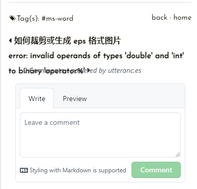
原来的评论系统用的是Gitalk,后来【Hugo 博客自定义优化 I】中更换为Valine评论,但是时间久远后台已经不能用了。遂更换为【utterances】评论,按照官网的介绍,它足够小而强大。
安装utterances
在安装之前先创建一个public仓库,这个仓库的issue是用来存放博客评论的。
在【这里】安装utterances,然后选择刚刚新建的仓库后保存。对于我的主题来说,在\themes\mogege\layouts\partials\gitalk.html文件中更改为
<script src="https://utteranc.es/client.js"
  repo="your reponame"
  issue-term="pathname"
  label="Comment"
  theme="github-light"
  crossorigin="anonymous"
  async>
</script>

<style>
    .utterances {
        max-width: 99%;
    }
</style>其中的<style>标签是更改默认的宽度的,这一点官网也有说明。如果你是想在自己的主题中加入utterances评论,可以参考以下文章:
5. Google分析
按照原主题的配置方法,在congfig.toml文件中加入Google的UA追踪代码即可。但是根据Google的公告
本文介绍的是 Universal Analytics 媒体资源,这些媒体资源将于 2023 年 7 月 1 日起停止处理数据(Analytics 360 媒体资源从 2023 年 10 月 1 日起停止)。请开始使用 Google Analytics(分析)4 媒体资源(如果您尚未开始)。
也就是说还不如一步到位,使用新版的分析方法。添加过程和之前的方法类似,可以参考【为网站设置 Google Analytics(分析)(Universal Analytics)】和【Hugo中使用Google Analytics】等文章。
6. 移动端适用性优化
好的网站博客不仅要在客户端显示良好,移动端也不容忽视。我在Google Search Console中发现自己的网站在移动端有着许多问题
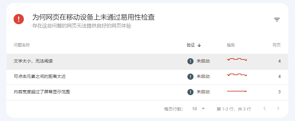
为了提供良好的网页体验,大致发现了以下原因,总结几点:
- 文章的标题级数从二级开始为妙(主要是针对之前的文章修改)
- 文末的上下篇文章有的因为标题太长而导致页面元素重叠
为了解决以上问题,在开发者模式找出对应元素并修改其样式,在网上搜索到如何省略过长的文字,有很多方法和措施,具体对应到自己的主题就是更改\resources\_gen\assets\scss\css\main.scss_b95b077eb505d5c0aff8055eaced30ad.content文件中的元素赋值,注意上下篇导航的差异性
.post-warp .post-nav a.prev{
    font-weight: 600;
    font-size: 16px;
    transition-property: transform;
    transition-timing-function: ease-out;
    transition-duration: 0.3s;
    white-space: nowrap;
    text-overflow: ellipsis;
    overflow: hidden;
}
.post-warp .post-nav a.next {
    font-weight: 600;
    font-size: 16px;
    transition-property: transform;
    transition-timing-function: ease-out;
    transition-duration: 0.3s;
    white-space: nowrap;
    text-overflow: ellipsis;
    overflow: hidden;
    direction: ltr;
    text-align:right;
}
但是这样还不够,还需要设置,每个标题的宽度,前后篇都要设置。
.post-warp .post-nav a.prev {
    float: left;
    width: 90%;
}

.post-warp .post-nav a.next {
    float: right;
    width: 90%;
}
这里的设置会导致箭头消失,办法就是在样式将文字和图标分离,但是不想折腾了。
7. 个人主页设置
同样是看到Mogeko’s Blog的主页GitHub信息,找到了设置方法:
- Github Chart API
- GitHub Readme Stats
- 可设置样式足够多,也可以自定义
- 可设置样式足够多,也可以自定义