一般的MRI数据分析软件(例如AFNI、FSL等)都有可视化的功能,但是往往只能通过另存为的方法导出,且对于Colorbar、图片比例等设置难以高度自定义。本文介绍一个基于Python的Nilearn库,可以用于统计分析以及可视化MRI。官网是这样介绍的:
Nilearn enables approachable and versatile analyses of brain volumes. It provides statistical and machine-learning tools, with instructive documentation & open community.
本文可以学到什么
本文你可以看到一些在手册中可能找不到的用法,比如:
- 如何裁剪,只呈现部分区域?
- 如何设置自定义的Colorbar
- 如何翻转矢状面(枕部在左还是右)
本文不包括基本的用法:
- 一般的三维截面显示
- 多slice显示等
同样也不包括统计分析等使用,仅仅是可视化已经处理好的结果
如何裁剪特定区域
对于这个需求,我想应该是普遍的,特别是对于ROI区域结果的展示,因为呈现整个大脑会让结果不那么突出。
参考链接:Plotting with nilearn: Any possibility to zoom or to visualize section of image?
基本思路
- 获取每个绘图对象的坐标轴属性,然后设定范围即可
示例代码
from nilearn import plotting, datasets atlas = datasets.fetch_atlas_destrieux_2009() disp = plotting.plot_roi(atlas["maps"]) disp.axes["x"].ax.set_xlim(-30, 30) # 主要是这两行代码 disp.axes["x"].ax.set_ylim(-30, 30) plotting.show()结果展示(这种情况只能通过可视化软件一点点尝试想要裁剪的区域)
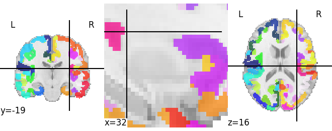
Nilearn可视化示例结果
翻转矢状面切片
基本情况:
- 在Nilearn中,矢状面的显示为前部(Anterior)在右侧,后部(Posterior)在左侧,如下例图所示。
裁剪特定区域
- 在Nilearn中,矢状面的显示为前部(Anterior)在右侧,后部(Posterior)在左侧,如下例图所示。
基本需求
- 将前部显示在左侧,后部显示在右侧
- 实现方法就是翻转下坐标轴
参考链接:Show nilearn plots from both sides in sagittal view
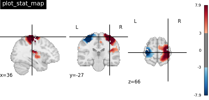
from nilearn import datasets
from nilearn import plotting
stat_img = datasets.load_sample_motor_activation_image()
display = plotting.plot_stat_map(
stat_img,
display_mode="x",
cut_coords=3,
title="display_mode='x', cut_coords=3",
)
# 以下是反转的代码
T = list(range(0,3))
for t in T:
ax = list(display.axes.values())[t].ax
ax.set_xlim(*ax.get_xlim()[::-1])
自定义Colorbar范围
这一部分内容其实算不上关于Nilearn的使用方法,更多的是Python的范畴。但就写在这里了吧~
在Python的Matplotlib库中的可选Colormaps,我们可能只想要一个部分的显示范围,这个如何实现?
参考链接:python绘图:截取matplotlib colormap色谱的一部分
主要原理就是截取范围内的Colorbar,然后生成新的Cmap
示例代码:
import matplotlib.colors as colors
import matplotlib.pyplot as plt
import numpy as np

def truncate_colormap(cmap, minval=0.0, maxval=1.0, n=100):
    new_cmap = colors.LinearSegmentedColormap.from_list(
        "trunc({n},{a:.2f},{b:.2f})".format(n=cmap.name, a=minval, b=maxval),
        cmap(np.linspace(minval, maxval, n)),
    )
    return new_cmap

cmap = plt.get_cmap("Spectral")
# 新的cmap,这样就可以直接使用了
trunc_cmap = truncate_colormap(cmap, 0.2, 0.8)
展示不同区域
- 基本需求介绍
- 你的MRI数据中的结果是离散的,而且不同的值代表了不同的含义
- 含义可以是各种各样的,比如这一连串离散值代表了不同的区域,样本etc.
直接上代码(链接:https://rec.ustc.edu.cn/share/a8366fa0-0077-11ef-91de-c127b1bf6ec8 密码: wtk8 ,有效期到2026-06-31)
import matplotlib.pyplot as plt
import numpy as np
from matplotlib import cm
import matplotlib as mpl
from nilearn import plotting
from matplotlib.colors import ListedColormap
stat_img = "your mri file dic"

fig1 = plt.figure(figsize=(7, 3),dpi = 300)
# 如果你有多个你就可以罗列多个(没有试过,如果有需求可以试试
legend_elements = [plt.Line2D([0], [0], marker='s', color='w', markerfacecolor='#00FFFF', markersize=14, label='DoG-1'),
                 plt.Line2D([0], [0], marker='s', color='w', markerfacecolor='#FF0000', markersize=14, label='DoG-2')]
plotting.plot_stat_map(
  stat_img,
  display_mode="z",
  cut_coords=[1,4,8,12],
  cmap=cm.get_cmap('hsv',2045),
  colorbar = False,
  cbar_tick_format = "%.3g",
  figure = fig1,
  threshold = 0.9999,
  # output_file = "dog1.pdf",
)
fig1.legend(handles=legend_elements, loc='upper left',ncol = 2, bbox_to_anchor=(0.005, 1))
plt.show() # Replace with plt.savefig if you want to save a file
结果展示

示例结果
$\cdots$ 什么都略懂一点,生活更多彩一些 $\cdots$
$\cdots$ end $\cdots$